Second Star on the Right

Hello faithful followers!

So much has happened, with so little time to tell it. However, there will be more time in the future. Rest assured I will be sharing cool drawings and stories with you over the next few months that should illuminate what I have been up to lately.

The past few months have been comprised of freelance work, preparing for the CTN animation expo and taking Nathan Fowkes' Color and Light class through Schoolism. It has been an intense time of growth, both artistically and personally. I took a break from sharing content in order to focus on learning with all of my spare time, as well as making some big decisions. I have a lot to share and plenty to talk about when I return from the conference. 

You might have noticed I updated the portfolio on my website. Please do check it out and let me know your thoughts! To share a little of my process, I thought I would include a look into how I created my painting of Peter Pan:


To achieve the original above, I started with a loose sketch in the general tone I wanted for the finish. My thought is that it would be really cool to have Pan standing confidently with the sun shining in behind him. However, I also wanted him to be lit from a cool skylight above. At that time, I thought my colors were pure. It's amazing how our eyes can become accustomed to the tones.


The second step was to start introducing cool tones and local colors. After the color was basically established, I started to push and pull the color and values to increase the impact of the image. I am very happy with how this image turned out, and I am excited to try and push it even more in future paintings.

I hope you enjoyed seeing some of this process, and I will see you all after CTNX! Until then, it's straight on till morning!


Bringing Back an Old Face

After a little time away, I have decided to revisit the design for Gustaff. As his story has changed, so has his character. As a result, I have taken his visual design in a new direction that I am very pleased with. Look for more designs from this series in the near future!


View outside my window

I decided to do a quick digital study of the view outside my window. Enjoy!

Robot Portrait

Here is a look at some more recent digital painting I did. I've really been enjoying painting these robots. Definitely a fun challenge!


SCAD Learning Culture Credo

Here is the final product of my work at SCAD, the Learning Culture Credo. The school decided to distribute the new document in the form of a small sketchbook. The front of the book contains the Learning Culture Credo and a statement about why the credo was made. The pages following the credo are blank so that the students can draw or write on them. The goal was for the Learning Culture Credo to be more applicable and relevant to the students, and I think this book, along with the entire process of revising the credo statements, achieved that very well. 


For my contribution, SCAD designers compiled my drawings onto the cover of the book. I really enjoy the way they composed the images to create a fun, yet clean design. Although we had explored using illustrations in the actual document, I think this was a much more successful implementation of the drawings that also reminds people of how the document was made and, as a result, why it is relevant and important to their lives.


So there you have it! I am very excited to have been a part of this Studio Culture Project. It was really interesting to explore how visuals can aid in the creation of a completely verbal document, especially between a bunch of artists. I learned a lot from the experience, it was a pleasure to work with the faculty and staff of SCAD, the School of Building Arts and the Architecture Department. I sincerely hope that the document helps produce the learning culture they desire.

Studio Culture Event (Part 3)

While the students were responding to the prompts I posted last week, I was setting up my station inside the auditorium. I was going to be drawing under an Elmo projector, which would be displayed on a big screen to the audience, along with other powerpoint presentations and word collecting applications. It was a huge multimedia breakfast extravaganza. I was drawing directly with ink, which meant there was no room for fixing mistakes. Needless to say, this was a rather new experience for me, so I spent a little time warming up as students entered.

This is about the time when you are 
asking yourself, "Can I do this?"


The Moment of Truth
Before I knew it, the event was off and running! Curtis was engaging the students as I tried to record the essence of what was said. It all went by in a blur because I was focusing on capturing as much information as possible. I was working so quickly that I forgot they had given me a microphone. Suddenly, Curtis turned the mic over to me and they asked me to offer a recap of what we had already talked about. Miraculously, I was able to recall everything that had happened. The drawings helped bring all of the conversations back fresh into my head, and I successfully caught everyone up to speed.

At this point, I was already getting worried. There
Were errors in the picture that I couldn't fix and
didn't have time to fix. 

This time, I tried to draw more lightly with a different pencil,
but one of the staff came up and informed me nobody could
see what I was drawing. That meant I couldn't
spend time planning the drawings either. 


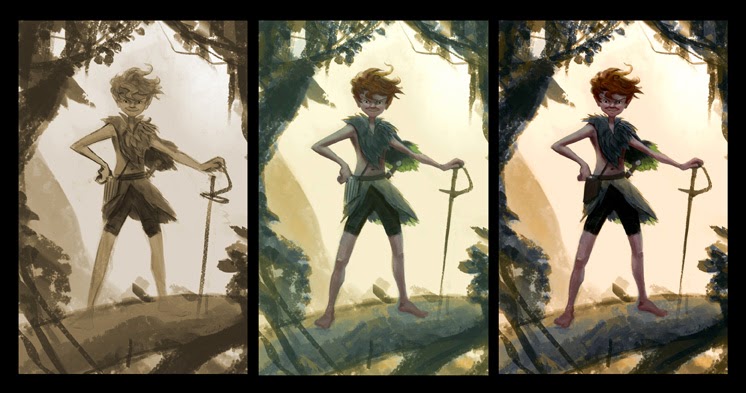
About halfway through the event, I started to realize my drawing strategy was completely wrong. I had been trying to make pretty drawings instead of trying to record the thoughts expressed. Once I grasped this and started using a more shorthand drawing style, the images instantly became twice as lively. 


I once heard Sergio Aragones say that 
drawing in front of people is not about drawing 
well, it's about drawing fast...he was right! 

These drawings are definitely not the most beautiful 
of my career, but they hold a functional charm that 
has grown on me. 

At first, I thought I did a really 
bad job because the drawings weren't 
what I expected to do. 


However, I received only positive feedback 
from students and faculty after the event.

 In hindsight, I realized that the later drawings allowed 
me to capture more information and take a more 
graphic approach, which proved very 
useful for the final product. 


Thinking back to the event, I realized that I was faced with a huge, split-second decision that had a lot to do with how I wanted people to view me. I resisted drawing in my shorthand because I thought it wasn't good enough, but the opposite proved true. The moment I stopped trying to win people's approval was the moment everything started to work. 

Moral of the story: 
If you want to be humbled,
draw in front of a crowd.

Caveat:
This will not work if you excel
at drawing in front of crowds.


One side of me still wants to hide these in an old box so that nobody will see them, but they are a vital part of this story. Hiding them just wouldn't do it justice. So that is a look at the Studio Culture Event from my perspective. It was a thrilling opportunity that was way outside of my comfort zone, but I actually would like to try it again some day! If you want to get a firsthand look, Professor Arpad Ronaszegi took some very nice photos of the event. Please visit his blog to see things from his viewpoint!

Next week, I will unveil the final product of this entire process!

Studio Culture Event (Part 2)

Following last week's post about my preliminary work with SCAD, the next two weeks will be about my role during the Studio Culture Event. Today's post will focus on the artwork I created before the event.

The goal was for the students to be in a creative, problem-solving mindset before walking into the event. After some discussion, the committee agreed that I would create visual comic strip "prompts" to engage the students before they entered the auditorium where Curtis Zimmerman would walk them through revising the Studio Culture Document. The comic prompts would put hypothetical situations before the students to get them thinking about things from an unbiased, 30,000 foot view.

The comic prompts took several iterations to land on a good format. The delicate balance between being too obvious and offering too much freedom of interpretation was tough. However, we finally landed on having a nice illustration with empty comic panels. I have included a few examples of prompts below:


The blue illustrations were there to give the pages some style. When I created the poster, I unintentionally established the color palette for the entire event. I attempted to stay consistent with that while creating new, energetic illustrations to inspire the students. The use of abstract, textural elements with hand-drawn sketches seemed to do the trick. 

The examples with filled-in panels were there to help the students understand the point of the empty squares on the page. We kept them rough so that students would feel open to drawing in them. If you make something too pristine, people don't want to mess it up. Our hope was that the students would feel comfortable drawing on the page, no matter what their skill level was. The entire goal of the event was to get students excited about the studio culture, and these seemed to help with that purpose. 

Here is a closer look at the illustrations I created for the prompts. I put a little extra polish on one of them before posting. Sometimes you just can't keep yourself from touching up an old work of art. 


Stay tuned next week for more on my role during the event!


SCAD Studio Culture Event Part 1

I recently completed a long-term project with the SCAD Architecture Department. My role on the project was to offer visual suggestions for the Studio Culture Event, a function aimed at increasing student involvement in the revising of the Studio Culture Document. Among the many ideas thrown at the wall, a few of them stuck.

First of all, I was responsible for coming up with some sort of interesting way to incorporate visuals into the event and the final document. To do this, I sketched out ideas and presented them to the committee in charge of the event. Here are a few of the sketches:


The aim of this image was to convey the 
progression from student to professional.


This image's purpose was to explore a 
new way to format the final document.


This image was used to explore a stylistic
way to show how each student brings 
something different to SCAD's studios.


My first full assignment was to create a poster image that would generate interest in the Studio Culture Event, seen below:


The original version of the poster had a girl on the left, but I decided to edit it in order to increase the visual interest. My goal was to work with the positive/negative play of shapes in order  to create a loose, yet readable image. It has a very structured composition, but a tonal, textured rendering that helped keep the piece lively. The last thing I wanted it to say was "Come to this typical, boring event."

That's a look at the early stages of the project. Next week, I will share some images that were used for the actual event. Stay tuned!

Sunrise

This morning, I ventured out to do a plein air oil sketch. I found a neat spot to park my car and set up the easel in front of a large marsh.

I thought I was going to miss the sun cresting but managed to get my paints together just before it rose (a miracle to be sure). From that point it was a mad dash to capture as much information as possible without blinding myself. About 30 minutes later, up to my elbows in oil paint, I ended up with what you see below:


Lesson of the day: It is way more difficult to paint outdoors with oils 
than it is to sit in my comfortable studio on my computer.

Even though it was a rough start, ranging from oil paint complications to forgetting my palette knife (note: pocket knives are NOT a good substitute), it all came together to be quite the adventure. Always good to start the day creating in creation. I can't wait to try it again!

And we're back...with robots!

After a long time of transition, I am finally back! I have just settled into a new studio after a few months of being in limbo between two areas of living. Now, I am completely stationed in Savannah and ready to get back to making work. It's so encouraging to see people viewing my blog even in the absence of updates. Thank you for your interest in my work and my life. 

The past few months have been filled with more teaching of art than producing it, but I have been growing as an artist all the same thanks to little lessons I learn from God each day. It's so cool how He will teach you a deeper principle by just observing the way creation works, like light falling on a structure or the natural shape that trees are conformed to. It puts a whole new swing on the prayer, "Give me eyes with which to see". Ha.

For this post, I thought I would share a robot I have been working on recently. I applied some of the lessons I have been learning lately, and I think they really added some appeal to the design. What do you think?


Xenozoic Tales


Exciting news! Flesk Publishing recently revealed a new cover for Xenozoic Tales that is coming out this summer, and Mark Schultz gave me the honor to color the new cover for this great story. Please check it out and pick up a copy!

You can see a comparison of the old and new covers at Flesk's Blog.


Xcel Magazine Continued

Here is a look at some more illustrations I did for the Xcel Magazine. Enjoy!


This is a portrait of Nathan Daniel, a good
friend and fellow artist. Nathan worked on the 
Xcel web site and the formatting for the magazine.

This is a self-portrait. The portraits were used 
to identify who the artists were that worked
on the magazine. We had the option of using
photos, but I thought this would be more interesting.


This was an interior illustration for an article written by
Jeff Fields, one of the Xcel board members. After reading
the article, I decided to emphasize the theme of leadership
that Jeff showed in his career as a pilot and trainer.

Xcel Magazine

Hello everyone,

2013 has already started off with a bang! In addition to freelance work with SCAD, I have been teaching cartooning classes and offering private lessons for kids. Although teaching can be incredibly useful for learning, I don't have much to show for it, which is partly why the blog has been to sparse on updates. I have been working on side-projects, but many of them are long-term endeavors that I am not ready to reveal at this time. I have been making good progress and hope to share some things soon.

What I can share is my work for the Xcel magazine called The Network. It was created to help increase Xcel's exposure and share their message with local businesses in Savannah. I helped illustrate and plan the incorporation of text into the illustrations. Hope you enjoy!


In the magazine, this illustration was  used as a vingette
 for an article about the Xcel Network. The writing at the top was 
replaced by the text of the article, and I thought it looked pretty sharp,
since the text also pointed down towards the man in the center. 


The following three images were used to explain the story of the rocket,
and it employs the original drawings I did for Xcel's teaching curriculum. 


 There is more to come from Xcel and other projects. I hope your 2013 is off to a good, productive start and that you are heading for new, exciting places.